How to Create an Exploded View Product Infographic with AI (2026 Guide)
Wondering how to create an exploded view product infographic in 2026? You have three production paths: an AI prompt recipe (ChatGPT image generation plus an optional Veo 2 or Kling animation), a purpose-built AI exploded view generator like VibeSKU's Product Exploded Infographic template, or a traditional design tool like Adobe Illustrator. The template path is the fastest and preserves the actual SKU; the prompt path is flexible but hallucinates components; the design-tool path gives the most control but needs a designer.
This guide walks through all three, the decision framework for picking between them, and the PDP, Amazon A+, and ad placements each one fits.
Introduction
Every ingredient-led PDP has a slot 3 problem.
Slot 1 is the packshot. Slot 2 is the lifestyle. And slot 3, the one that does the heavy lifting for supplements, skincare, tech, and anything else where shoppers need to know what's inside, is usually an exploded-view infographic. Miss it, and the product detail page converts like an unbranded packshot. Ship it wrong, and it quietly undermines every ingredient claim on the page.
That's why this asset is having a moment in 2026. The rise of AI image generation has made exploded views feel accessible to every brand, not just the ones with a retained illustrator. The tradeoff: generic AI tools hallucinate the product. A ChatGPT prompt for "exploded view of this serum" returns a stylized bottle that looks nothing like your SKU, with ingredient callouts the model invented from context clues.
This guide is for the ecommerce operator who wants to ship this asset without a week-long designer queue, and without pretending the hallucination problem doesn't exist. You'll see three production paths, when each is the right call, and how the infographic slots into a full PDP gallery so it actually converts.
Key Takeaways
- An exploded view product infographic is a PDP, Amazon A+, or ad asset that pulls a product's ingredients, components, or layers apart and labels each one. It's a conversion asset, not a technical drawing.
- Three production paths in 2026: AI prompt (ChatGPT image gen plus optional Veo 2 animation), purpose-built template (VibeSKU's Product Exploded Infographic template), or a traditional design tool like Illustrator.
- Product fidelity is the failure mode of generic AI prompts. The model invents components it doesn't recognize, so template-driven generation is the path that preserves the real SKU.
- Callout density matters. 4–7 callouts converts better than 10+. Split into two infographics before you cram.
- Static infographics win for PDP galleries and Amazon A+ modules. Short animations (2–4 seconds) win for Meta and TikTok feeds. Don't force one format into the other.
Prefer to see it in action first? Try the Product Exploded Infographic template with your own SKU photo, then come back for the decision framework.
If you want to see Path 1 in motion, this walkthrough runs the ChatGPT + Veo 2 flow end-to-end, prompt, static exploded view, then the short radial animation:
What is an exploded-view product infographic?
An exploded-view product infographic is an ecommerce visual that pulls a product's components, ingredients, or material layers apart and labels each one with a concise callout. It's used in PDP galleries, Amazon A+ content modules, email campaigns, and paid social feeds to explain what's inside a product, visually, without asking shoppers to read a spec paragraph.
It's not a technical drawing. CAD exploded views are for engineers and repair manuals. Ecommerce exploded views are for conversion: short copy, benefit-led callouts, and a product that still looks like itself at a mobile thumbnail.
Exploded view vs. cross-section vs. annotated packshot
Three adjacent formats get confused:
- Exploded view: components pulled apart, shown with spacing and callouts. Best for multi-part products (earbuds, skincare kits, supplements with delivery layers).
- Cross-section: product sliced open to reveal interior structure. Best for layered products (mattresses, food, running shoes).
- Annotated packshot: single image with overlay labels. Best when the parts aren't visually distinct but specific features need calling out.
Pick the format that shows what's actually worth showing. An annotated packshot for a single-material product will outperform a forced exploded view every time.
When to use an exploded-view infographic
Not every product earns this asset. It pulls its weight in a narrow set of categories.
High-fit categories:
- Beauty and skincare (ingredient callouts on serums, creams, masks)
- Supplements and nutraceuticals (active ingredient plus delivery format)
- Tech and gadgets (internal components for earbuds, chargers, wearables)
- Food and beverage (ingredient positioning, nutrition callouts)
- Apparel and footwear (fabric layers, materials, construction)
When a hero shot is enough:
- Simple, single-material products where "what's inside" doesn't drive the purchase decision
- Products where the claims don't depend on what's inside (decorative goods, accessories)
- Categories where shoppers are already literate and don't need ingredient education
When Sarah, a creative ops lead at a DTC skincare brand, audited her PDPs last quarter, she cut the exploded-view infographic on her toner (single ingredient, single benefit) and kept it on her serums (five active ingredients, layered benefits). PDP conversion on the toner ticked up three points once the slot went back to lifestyle. The asset is a tool, not a requirement. Use it where the claims earn it.
In ingredient-led categories this format is often called a product ingredient infographic. Same mechanic, narrower purpose: proving what's inside earns the sale.
Static infographic or animated exploded view?
Most exploded-view tutorials skip this decision entirely, they teach you how to make the asset and leave you to guess where it belongs.
| You need… | Pick… | Why |
|---|---|---|
| Shopify PDP gallery | Static infographic | PDPs render stills; callouts must be readable at mobile thumbnail |
| Amazon A+ content module | Static infographic | A+ blocks are images, not video |
| Meta or Instagram feed ad | Animated (2–4 seconds) | Motion earns the scroll-stop; callouts animate in as layers appear |
| TikTok or Reels ad | Animated (2–4 seconds) | Vertical motion performs; callouts large enough for phone screens |
| Email hero | Static | Most email clients don't autoplay video |
| Landing page hero | Either; static preferred | Static loads faster; animation optional with a static fallback |
The short version: static wins for owned surfaces where rendering is predictable. Exploded view animation wins for feed-based ad placements where motion is the attention lever.
Don't force one format into the other. Animated PDP assets that fall back to a blurry first frame hurt conversion. Static-only ads on TikTok hurt reach.
Three ways to make an exploded-view product infographic in 2026
Path 1: AI prompt recipe
Think of a general multimodal model as an AI exploded view generator on easy mode: fast, flexible, but fidelity-blind.
What it looks like: prompt a multimodal model (ChatGPT image tools, Gemini, or similar) with your product photo plus a recipe like "exploded view of this product, 5 labeled components radiating outward on a neutral background, studio lighting, callouts as clean horizontal labels with leader lines." A typical ChatGPT exploded view prompt pairs that structure with your product photo as reference. For animation, pass the output to Veo 2, Kling, or Runway for a 2–4 second radial motion sequence.
Strength: flexible, fast for a one-off, good for prototyping. Cheap if you already pay for the model.
Weakness: fidelity. The model reinvents components it doesn't understand. Ingredient infographics for real SKUs, where the spec actually matters, fail here. The bottle is close to your bottle. The five "ingredients" are plausibly five molecules. But neither is what you actually sell, and a shopper who compares the infographic to the product photo will catch the discrepancy.
Good for: prototypes, pitch decks, one-off social posts where accuracy isn't load-bearing.
Path 2: Purpose-built template tool
What it looks like: upload the SKU photo, pick a template built for exploded views, add component names and callouts, then export in the aspect ratios you need. VibeSKU's Product Exploded Infographic template (exploded-view) uses high-fidelity restoration to preserve the actual product, then builds the exploded layout around it with consistent typography.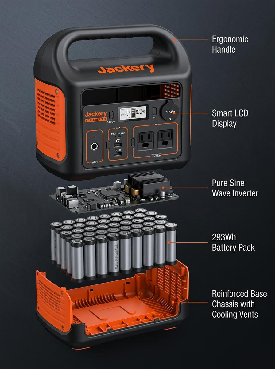
Strength: preserves the real product. Ships multiple aspect ratios from one session. Consistent brand typography across SKUs. No designer required.
Weakness: template constraints. You can't freely reinvent the composition. That's the point, but it's a real tradeoff for brands that want a bespoke look every time.
Good for: PDP galleries, Amazon A+ modules, brand-consistent catalog work. Any team that ships exploded-view infographics regularly enough that consistency matters.
Ready to see your own product as an exploded infographic? Open the
exploded-viewtemplate, upload one SKU photo, and export in PDP, A+, and ad-ready formats in a single session.
Path 3: Traditional design tool
What it looks like: a designer builds the exploded view manually in Adobe Illustrator or Figma. Vector parts, leader lines, callouts, typography, all hand-placed.
Strength: full creative control. Custom illustration. Flagship-level polish when the campaign deserves it.
Weakness: the slowest path. Needs a designer. Hardest to keep consistent across a 200-SKU catalog because every asset is bespoke, and every bespoke asset drifts from the brand system over time.
Good for: flagship campaigns where a hand-crafted illustration is worth the week. Brand identity refreshes. Anything where the asset is a hero, not a workhorse.
How to create an exploded view product infographic (step by step)
- Start with a clean product photo. A packshot or 3/4-angle shot works best. The cleaner the reference, the cleaner the output, regardless of which path you pick.
- List the 4–7 components, ingredients, or layers you want to show. Cut ruthlessly before you start designing.
- Write one-line callouts for each. Benefit-led beats spec-led. "Hydrates for 12 hours" beats "contains 2% hyaluronic acid" for most shoppers.
- Pick the aspect ratio for your target placement. PDP 1:1 or 4:5, Amazon A+ around 970x600, Meta feed 1:1 or 4:5, TikTok 9:16.
- Pick your production path using the decision framework above: prompt for prototypes, template for catalog work, designer for flagships.
- Generate the layout and review component fidelity before exporting. For AI-prompt output, compare the rendered product against the original photo. If components are invented, regenerate or switch paths.
- Export in multiple sizes for PDP, A+, and ad placements. One source, multiple aspect ratios. Don't re-brief the whole job for each format.
Exploded-view infographic best practices
The 4–7 callout rule
Callout density is the most common failure mode across every production path. Brand teams over-pack infographics because every ingredient feels load-bearing. Shoppers skim, so anything past 7 labels stops reading.
- 4–7 callouts, tested
- Each callout: one concept, one line, benefit-first
- If you have 10 ingredients worth showing, ship two infographics. Hero ingredients in one, supporting in another.
Lead with the hero ingredient
Hierarchy matters more than symmetry. Biggest callout, bolder weight, clearest position. Reserve it for the ingredient or component the PDP actually sells on. Everything else stays subordinate.
Typography and color
One type family, two weights maximum. Color pulled from the product or brand palette, not a rainbow of callout colors that each fight for attention. When Marcus launched his supplement brand's Q1 line, his first infographic batch had six different callout colors because each ingredient "wanted" one. The second batch, re-rendered with a single accent color on hero callouts and a neutral on supporting ones, converted 9% better on PDP. Less attention-seeking means more attention earned.
Product fidelity
Show the actual SKU. Stylized illustrations of "a bottle" for your specific serum break trust on ingredient claims. Shoppers compare the infographic to the product photo directly above it, and any mismatch reads as generic marketing copy. This is the one bar every path has to clear.
Aspect ratios and placement guide
Picking the right aspect ratio is a non-negotiable step in how to create an exploded view product infographic that ships across PDP, A+, and ad surfaces without re-briefing the whole job.
| Placement | Aspect Ratio | Typical Size | Key Constraint |
|---|---|---|---|
| Shopify PDP gallery | 1:1 or 4:5 | 2048x2048 / 2048x2560 | Readable at mobile thumbnail |
| Amazon A+ content block | Fixed layouts | 970x600 typical | Amazon module constraints |
| Meta / Instagram feed ad | 1:1 or 4:5 | 1080x1080 / 1080x1350 | Text density visible on mobile |
| TikTok / Reels / Shorts | 9:16 | 1080x1920 | Callouts large enough for phone reading |
| Email hero | 16:9 | 1200x600 | Legible at 50% zoom |
Shopify's own product media guidance recommends a 2048x2048 square, and A+ content modules follow Amazon Seller Central's fixed layouts. Don't guess. These specs change year over year.
Where the infographic fits in a PDP gallery
Slot by slot, a typical Shopify or Amazon PDP gallery runs:
- Hero packshot (product on clean background)
- Lifestyle or context shot (product in use)
- Exploded-view or ingredient infographic
- Scale, fit, or size reference
- Feature callout or USP poster
- Use case or how-to visual
The exploded infographic in slot 3 is the shift from "what it looks like" to "why it works." Baymard Institute's ecommerce product image research consistently flags PDP galleries with too few contextual images as a top conversion failure, specifically when the product's value isn't obvious from the packshot alone.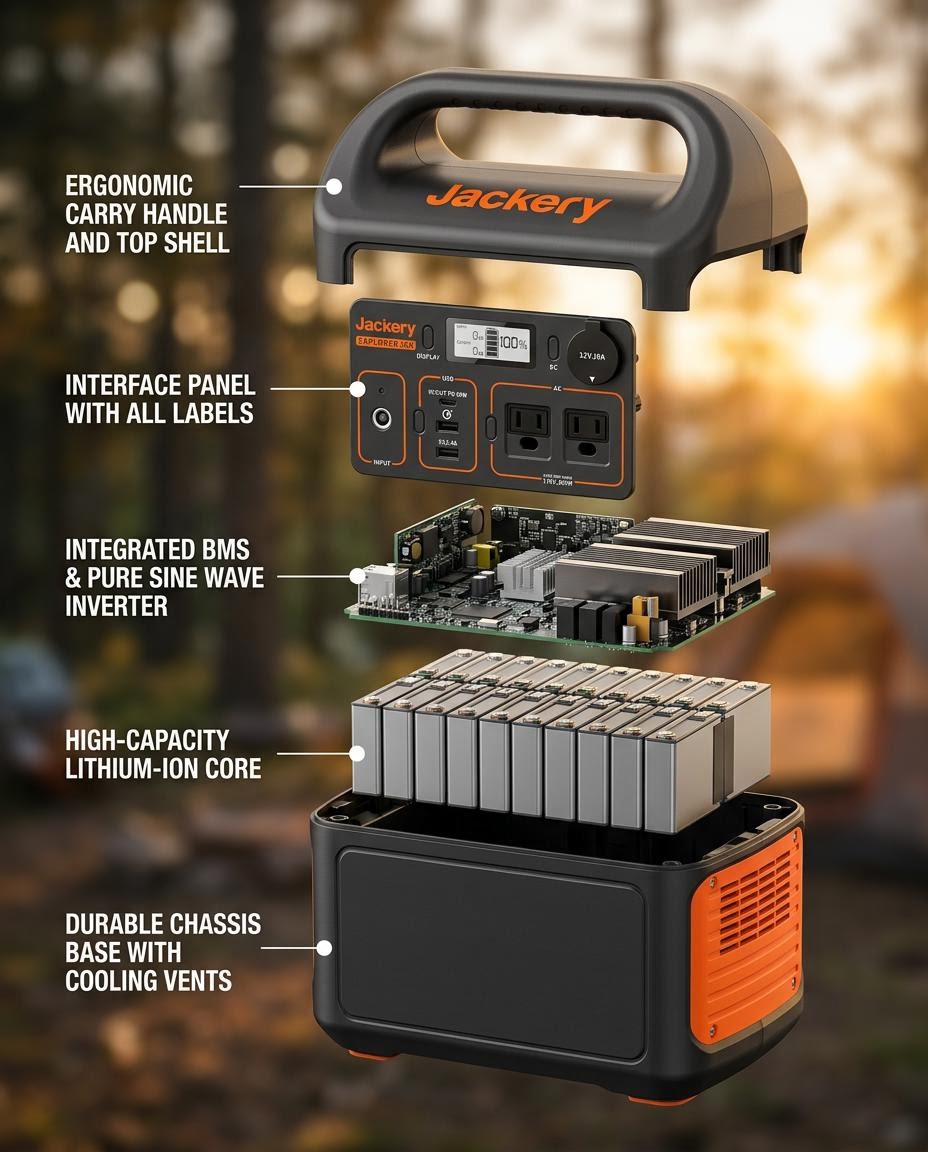
If you're shipping the infographic but not the surrounding gallery, the conversion lift is smaller than it should be. The Detail Page Poster Set template ships the matched set, and pairing it with the White Background Product Image template keeps the slot 1 packshot consistent with every PDP slot that follows.
Common mistakes (and the easy fixes)
Across every path for creating an exploded-view product infographic, the same five mistakes show up again and again.
- Too many callouts. Split into two infographics. 4–7 per asset, always.
- AI prompts that hallucinate the product. Switch to a template that grounds output on your real SKU photo.
- Forcing animation into static-only placements. PDP galleries and Amazon A+ don't autoplay video. Build static first, animate only for feed-based ad placements.
- Inconsistent typography across PDP slots. If your hero banner uses one font and your infographic uses another, the PDP reads like two different brands.
- Exporting one aspect ratio for every placement. The same infographic at 1:1 works for PDP and Meta but falls apart on TikTok. Export for each surface.
The matching listing copy matters too. If the bullets on the PDP claim five actives and the infographic shows three, the page reads as careless. The Listing Copy Generator template ships bullets and descriptions grounded in the same product facts the infographic labels, which closes the loop between visual and written proof.
FAQ
What is an exploded-view product infographic?
An exploded-view product infographic is an ecommerce visual that pulls a product's components, ingredients, or layers apart and labels each one. It lives in PDP galleries, Amazon A+ modules, and paid social ads. It's built for conversion, not engineering documentation.
How do I make an exploded view with ChatGPT or AI prompts?
Upload your product photo to a multimodal model (ChatGPT image generation, Gemini, Claude with image input) and prompt for an exploded view with 4–7 labeled components on a neutral background. Review the output for fidelity. AI prompts often invent components that don't match your SKU. For accuracy-sensitive assets like ingredient infographics, a template tool grounded on your real photo is more reliable than prompt iteration.
How many labels should an exploded-view infographic have?
Four to seven. More than seven and shoppers stop reading. If you have more ingredients worth showing, split into two infographics: hero ingredients in one, supporting in another.
What size should a product infographic be for Amazon A+ content?
Most Amazon A+ content modules use fixed layouts around 970x600 for standard image blocks, with larger sizes for premium A+ modules. Check the current Amazon Seller Central guidelines before export. Amazon updates module specs periodically.
Do I need Illustrator or a designer to make a product infographic?
No. Template-driven tools like VibeSKU's Product Exploded Infographic template produce publish-ready infographics from a single product photo in minutes, with no design software required. Illustrator gives you more custom control; templates give you consistency across a catalog.
When should I animate an exploded view instead of using a static image?
Animate for feed-based ad placements (Meta, Instagram Reels, TikTok) where motion earns the scroll-stop. Keep it static for PDP galleries, Amazon A+ modules, and email. Those surfaces render stills, not video, and an animated version just falls back to a weak first frame.
Ship it on your calendar, not theirs
That's the short answer to how to create an exploded view product infographic in 2026: match the production path to the stakes of the SKU. If you're prototyping or pitching, prompt-based AI gets you there faster than anything else. If you're shipping infographics across a 50-SKU catalog and need the product to actually look like the product, a purpose-built template tool is the shortcut. If the asset is a flagship and a designer-week is justified, build it in Illustrator.
The wrong answer is skipping the asset entirely because the production path feels heavy. Ingredient-led categories live and die on slot 3 of the PDP.
Ready to ship yours? Upload a product photo, generate the exploded view, and export in PDP, A+, and ad-ready formats in a single session. If you also need the surrounding gallery, the Campaign Collection template guide walks through the matched PDP poster set, and the full VibeSKU template library covers every other asset a launch needs.
Last updated: April 24, 2026 Author: Maya Chen, Ecommerce Creative Lead
